Alienum phaedrum torquatos nec eu, vis detraxit periculis ex, nihil expetendis in mei. Mei an pericula euripidis, hinc partem.

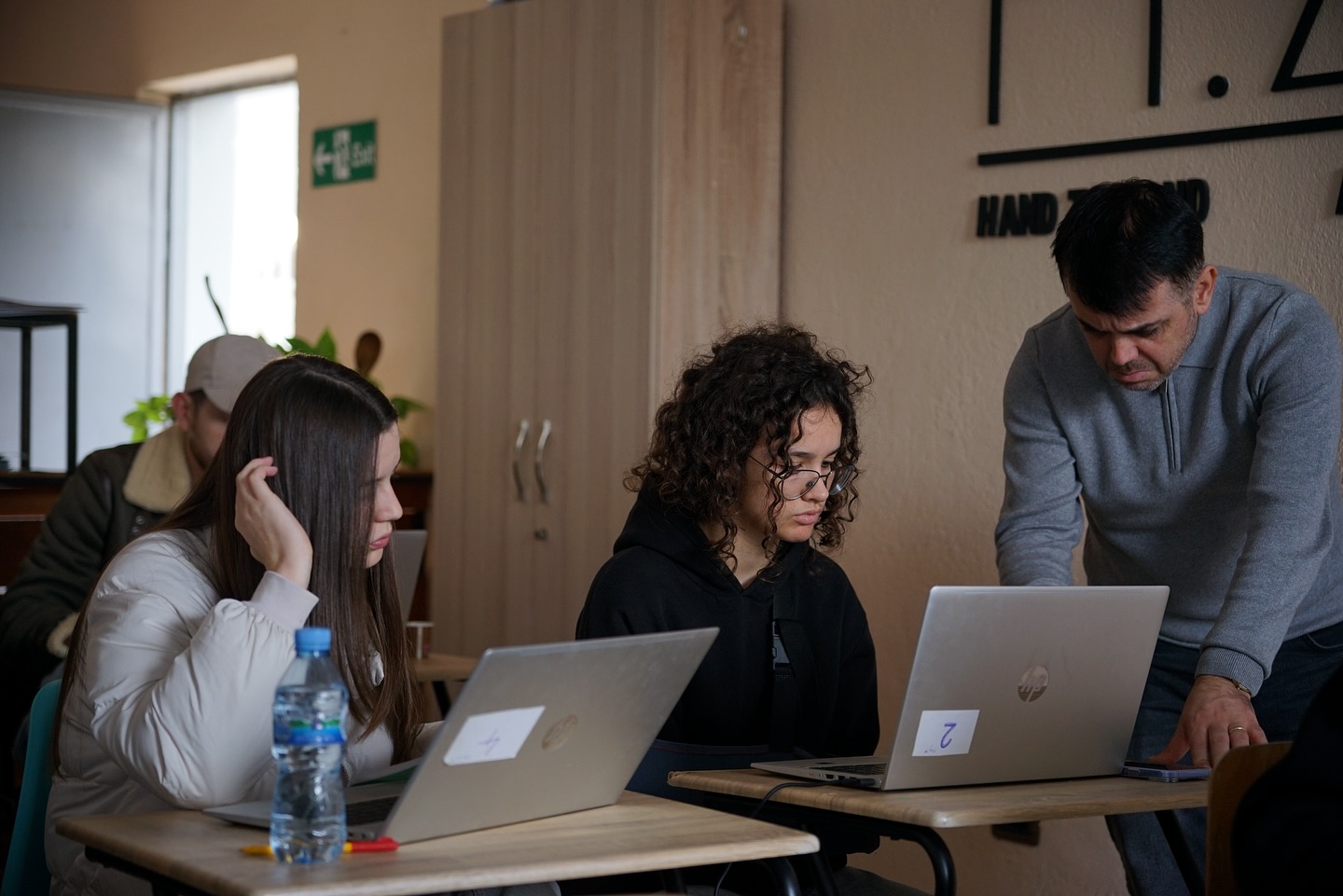
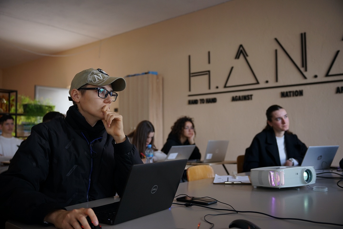
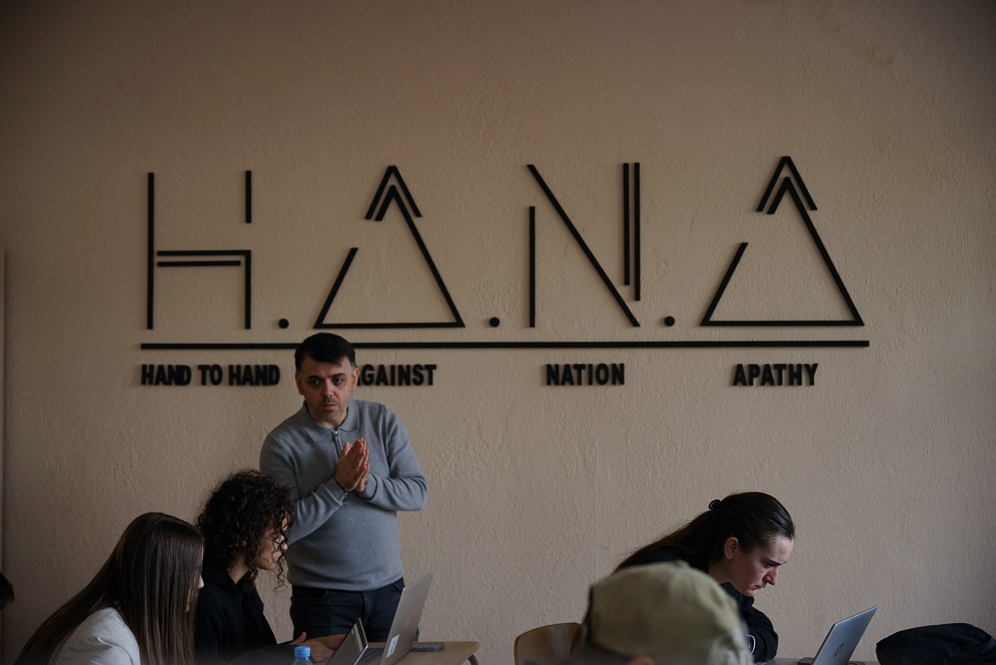
In the latest session of the Web & Graphic Design course, participants focused on one of the most practical and modern CSS techniques for building website layouts: Flexbox. During this session, students were introduced to how Flexbox helps organize elements into rows or columns, create balanced spacing, and build layouts that naturally adapt to any screen size. It’s an essential tool for anyone who wants to design clean, responsive websites without relying on overly complex CSS.
The session covered core concepts such as the difference between a container and items, the use of display: flex, and how to align content horizontally with justify-content and vertically with align-items. Students also explored how flex-direction changes the orientation of elements and how Flexbox simplifies building structured, professional layouts. In the practical part of the lesson, participants built simple layouts and created functional sections using just a few lines of code, showing how powerful and efficient Flexbox can be in real web design projects.