Alienum phaedrum torquatos nec eu, vis detraxit periculis ex, nihil expetendis in mei. Mei an pericula euripidis, hinc partem.

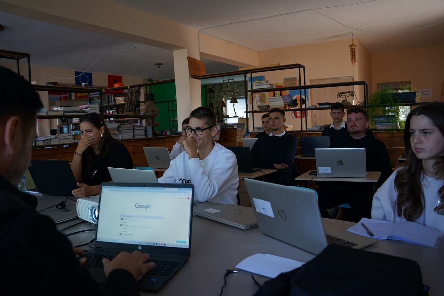
In this session of the Web & Graphic Design course, participants learned about forms and responsive HTML, understanding the importance of user interaction and adapting web pages to different devices.
During the session, students explored:
• How to create interactive forms using elements such as <input>, <textarea>, <button>, and <select>
• How to apply internal styling for a more professional appearance
• The principles of responsive HTML, including the use of meta viewport and media queries to ensure web pages adapt to mobile phones and tablets
To practice these skills, participants completed hands-on exercises, building functional forms for registration, applications, and contact pages, and tested their layouts across different devices to ensure usability and responsiveness.